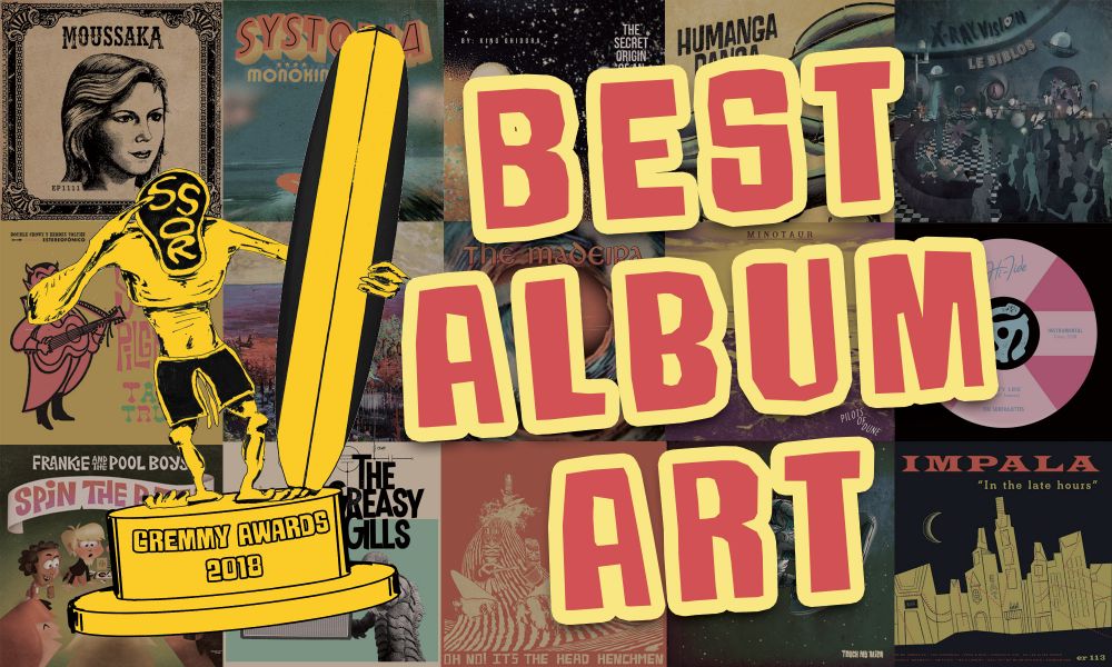
Surf has always had strong visual iconography attached to nudge how we interpret these instrumentals. We've built and expanded upon that just as we've transformed the music over the years. Here are some of the records where the art really stood out to me this year.
HONORABLE MENTIONS
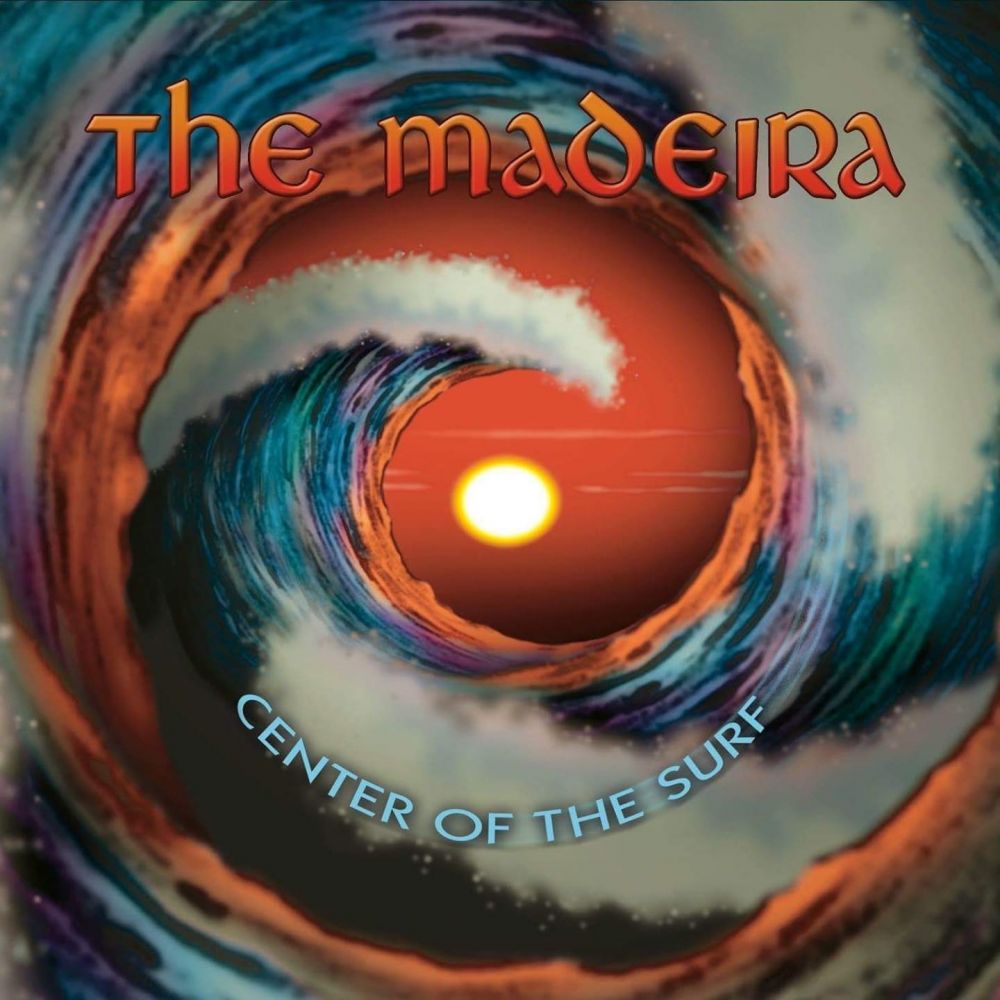
The Madeira - Center of the Surf
Artwork by Stephen Blickenstaff
Execution-wise there’s a bit of a photoshop filter overload going on here. I would have loved to see it hand-drawn and colored, particularly with Blickenstaff’s signature stippling. However, concept-wise I’m dumbfounded that in all these years of album covers depicting curling waves I’ve never seen anybody turn those curls into a spiral. And I love having it frame the sun. Surf still finds new ideas within its tight constraints both musically and visually.
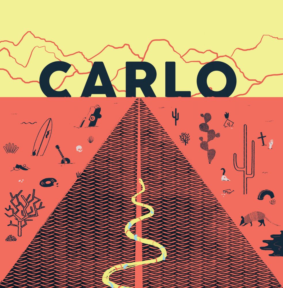
CARLO - CARLO
Artwork by Mike Ellis
Super minimal, doesn’t take itself very seriously, more to it than at first glance. Am I talking about the music or the album cover? Both I think. This is another one where seeing the full-sized LP is really striking and it reflects the music very well. Its minimal design and use of simple geometry is a different direction for a surf record (and much more in-line with en-vogue design) but it’s just so pleasing to look at.
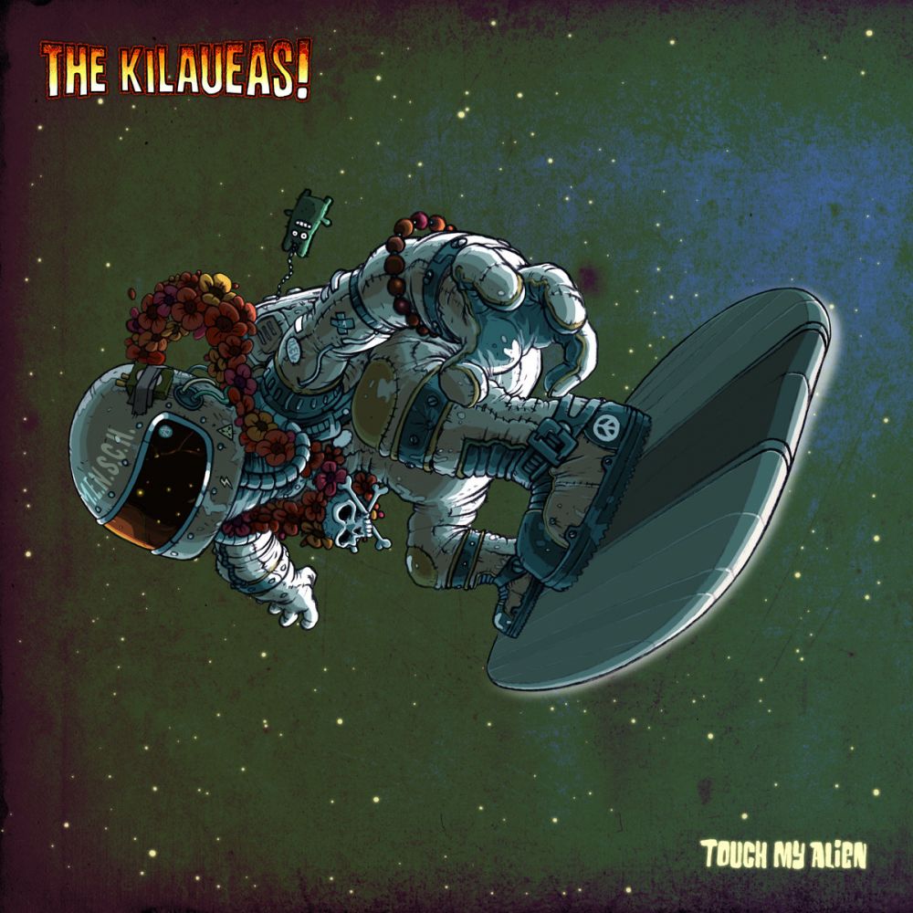
The Kilaueas - Touch My Alien
Artwork by Captain Fred
This doesn’t shed any light on the oddball title of the album, but I love all the details here: The cigarettes taped to the helmet (won’t do you much good in space…), the patches, the peace sign on the boot, the overall grime and wear of the spacesuit, like it’s been worn thousands of times. It’s very Kilaueas -- 100% surf-focused but humorous and goofy. But there’s some really good artistic sensibility here too: The lighting is really well done, clear where it’s coming from but also lending strangeness and mystery. I love the angle of the whole composition; you want to twist your head and put him upright, really makes you makes you feel like you’re in space. And I really appreciate having the text small enough to give the art some room to breathe. I bet it looks incredible on 12” vinyl.
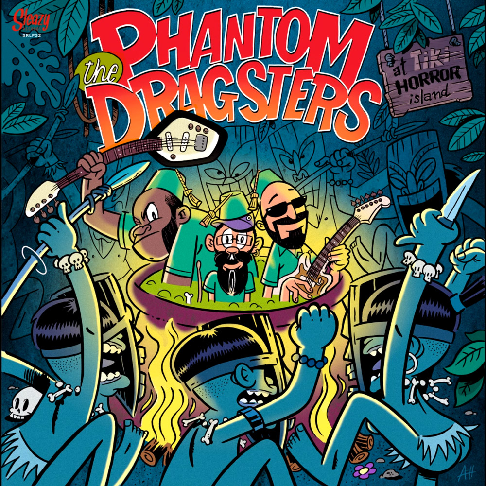
The Phantom Dragsters - At Tiki Horror Island
Artwork by Roberto Argüelles
This is one LP that simply looks great to hold and makes you want to hear what’s inside. Surf seems to have a bigger share of cartoon album art than most genres so you’ve gotta go above and beyond to stand out and there’s a lot to take in here. I love the way Roberto handles colors and I like the way you’re drawn into the center without too many lines explicitly pointing you there.
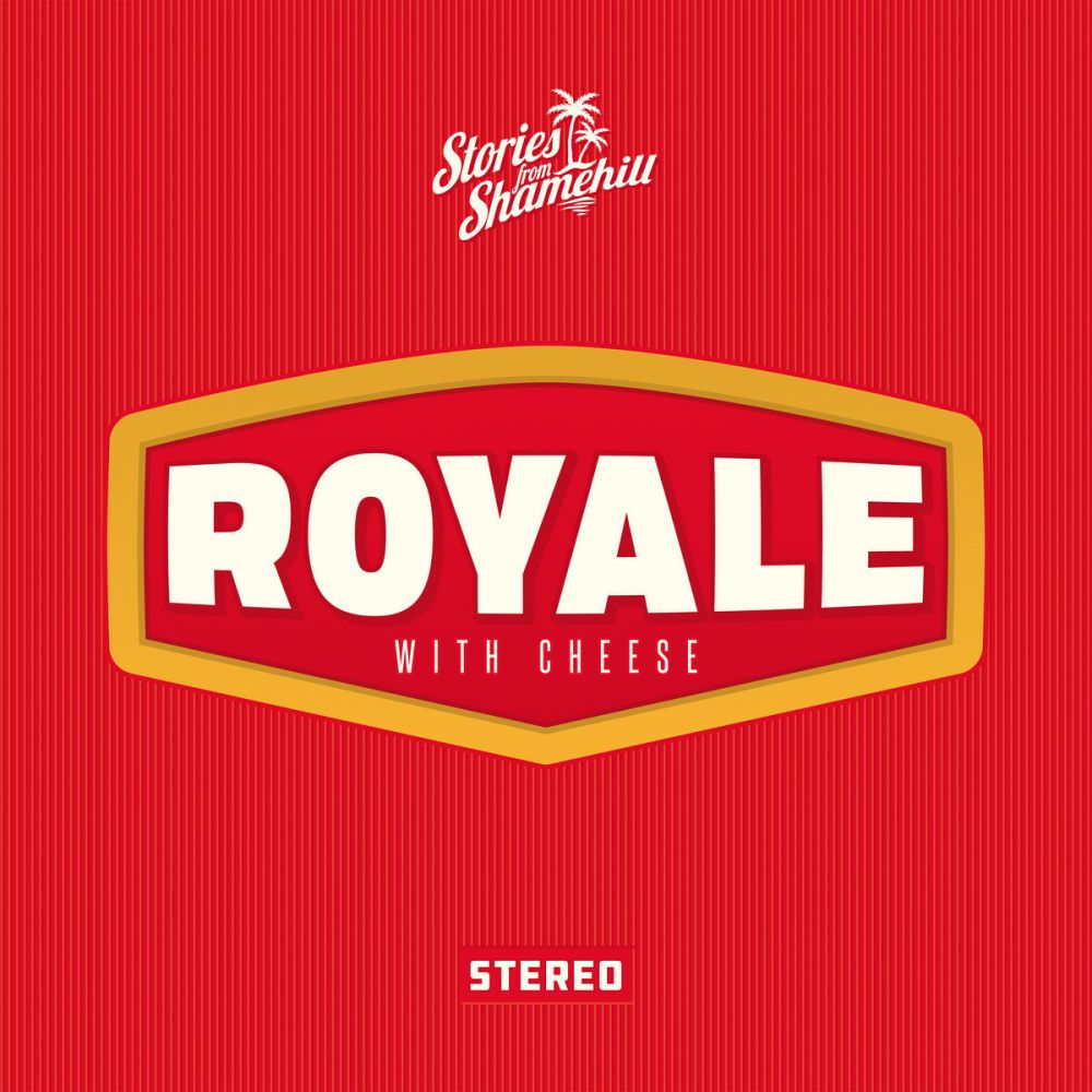
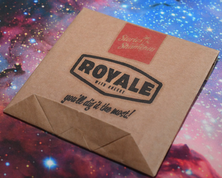
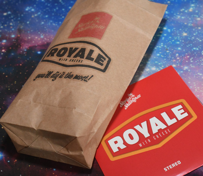
Stories from Shamehill - Royale with Cheese
What? It’s super boring! I thought so too until it came in the mail in a branded to-go bag. I’m a sucker for a gimmick.
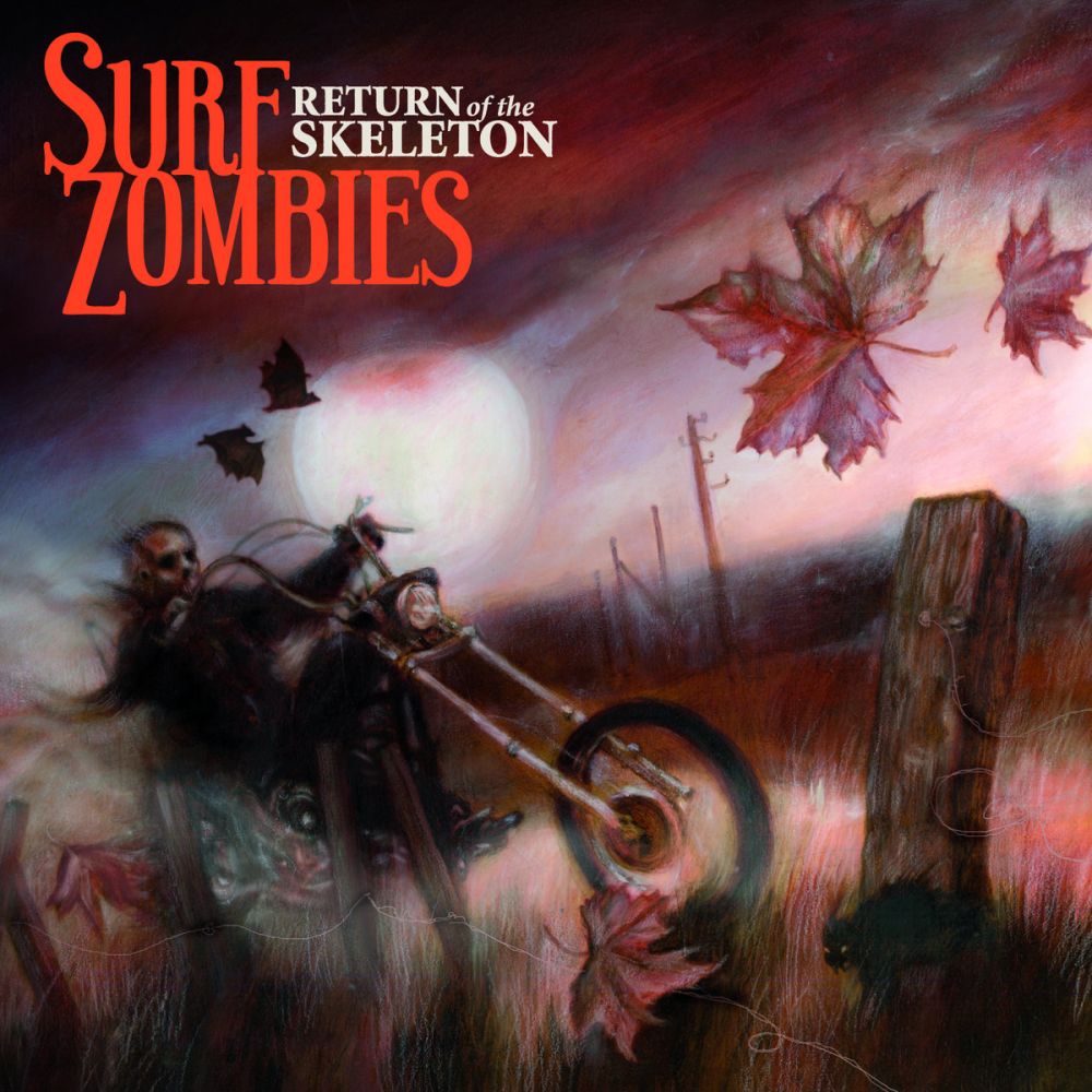
Surf Zombies - Return of the Skeleton
Artwork by Erin Wells
In this case I wouldn’t say the art was a perfect match. This would be some killer artwork for some skuzzy desert rock like Kyuss or such. Even the second song on this album is a bright and friendly tune. But hey, are you gonna turn good artwork like this down? You gotta love the hand-drawn touch and I especially love the haze floating all over this despite crystal clear pastel lines. I love that back cat in the corner, you might not notice it on first glance.
But I also love the text! It’s compact but does it all. The letters drip without looking like a silly Halloween font. The title of the album is so much smaller than the band name but it looks good and doesn’t really need to be bigger.
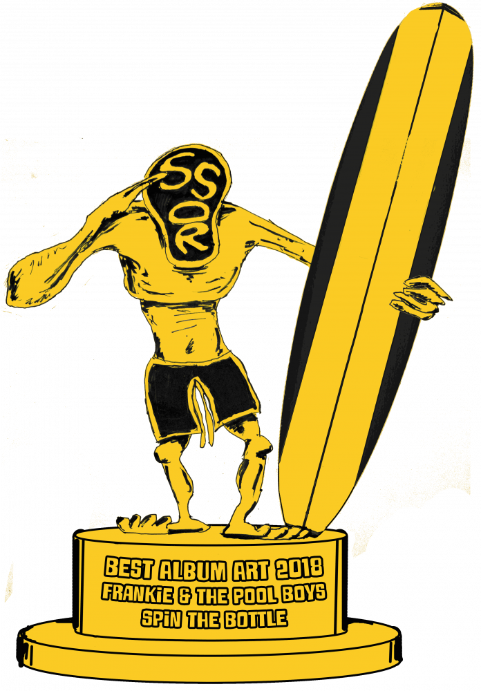
AND THE GREMMY GOES TO....
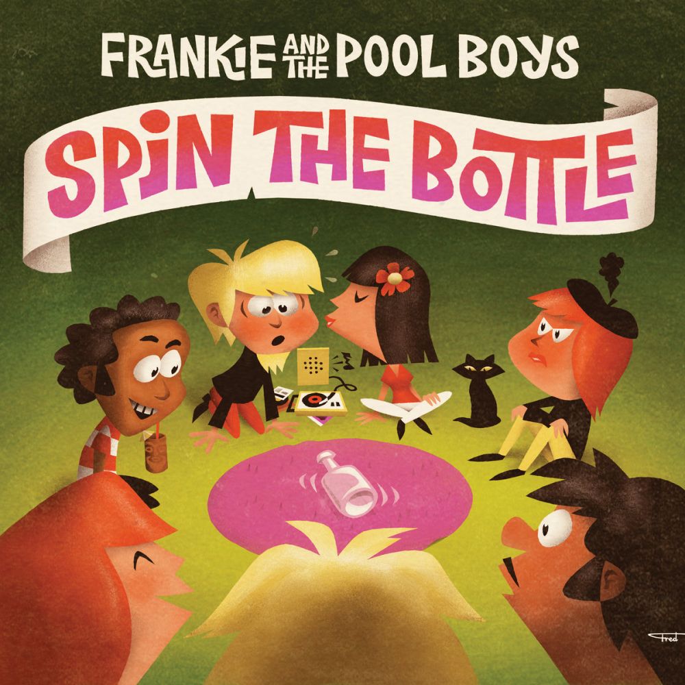
Frankie & the Pool Boys - Spin the Bottle
Artwork by Fred Lammers
Fred Lammers is no stranger to surf artwork (or Frankie and the Poolboys) and at this point I think I can recognize his work on sight. Spin the Bottle is a prompt he’s perfect for: in addition to his aesthetically pleasing use of color, simplified lines and subtle texture, he’s great with nostalgia and carefree childish fun.
Spin the Bottle is composed strikingly similarly to the Phantom Dragsters album (three figures in the foreground, light emitting from center) but I love the faces of all involved -- it’s got narrative! It’s such a fun album to look at, it makes you want to listen to the record, and best of all the music delivers on what it promises.
Side note: I also love the Ewa on the Beach/Tan Line Fever 7” art, particularly goofy naughtiness of a partially obscured but definitely visible nipple, as if you’re not even supposed to see it.
