I think album art is important. It can not only grab your eye and coax you into listening to a record, but it can inform the listening experience. Surf has developed a strong library of iconography over the years, not to mention a stable of excellent go-to artists. I always enjoy taking a moment to look into who these artists are and recognize them for giving a little more life to this music.
I like to present the images for this category nice and big, for obvious reasons. Although I should point out that if you really like any of these, you oughta buy the vinyl if available.
HONORABLE MENTIONS
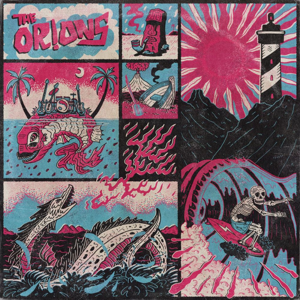
The Orions - The Orions by Elad Oran
The limited palate and offset shading give this a wood-block/screen-print look, but there's also a lot of intricate, small line details that really take advantage of the larger LP format. It's fun, dramatic, cartoony but also really well thought out.
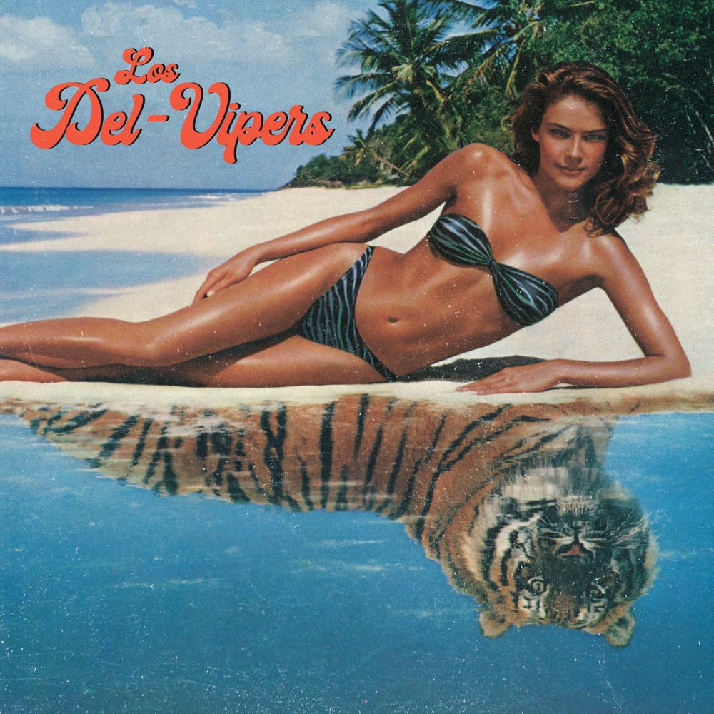
Del-Vipers - Los Del-Vipers by Ross Ott (guitarist)
There's not a whole lot of small detail to point out, but the concept is mysterious enough to entice you to listen, and that seductive mystery is reflected in the music in equal measure with tiger-like danger.
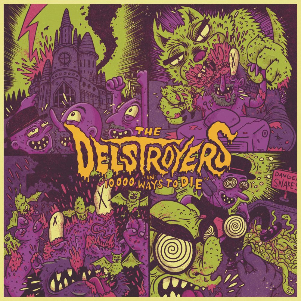
The Delstroyers - 10,000 Ways to Die By Tom Lowell
Even without looking too closely the Nickelodeon colors and frantic cartoonish style are enjoyable enough, but it tells a story too! I think cartoon violence suits their music pretty well.
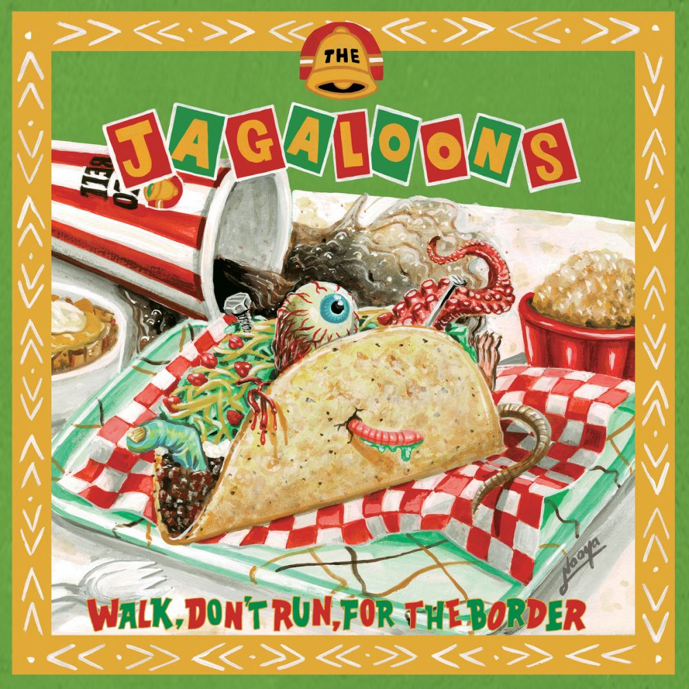
The Jagaloons - Walk, Don't Run, For the Border by Naoya Muga
Likely my favorite EP concept of the year has fitting artwork to go with it, depicting a taco filled with all the usual fast food extra surprises. They smartly turned to a self-proclaimed low-brow artist to do the dirty work. Lovingly painted and with plenty of detail to reward you for looking at it longer.
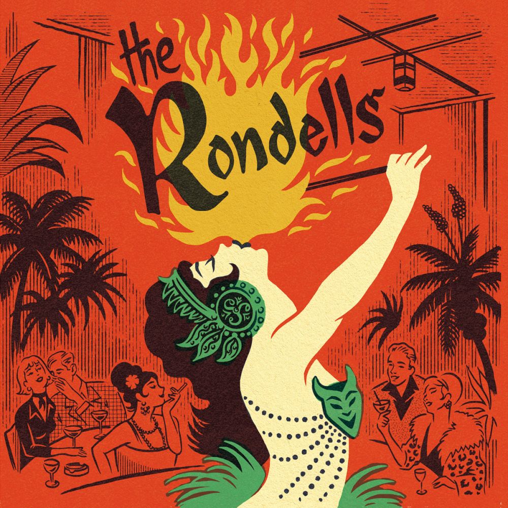
The Rondells - Exotic Sounds from Night Trips by El Marquès
I find this one striking despite being fairly simple. It nails just about everything -- beautiful lettering, great illustrations particularly on the background characters, and it's subtle but I love how the background "fades" to red as if lit by the flame.
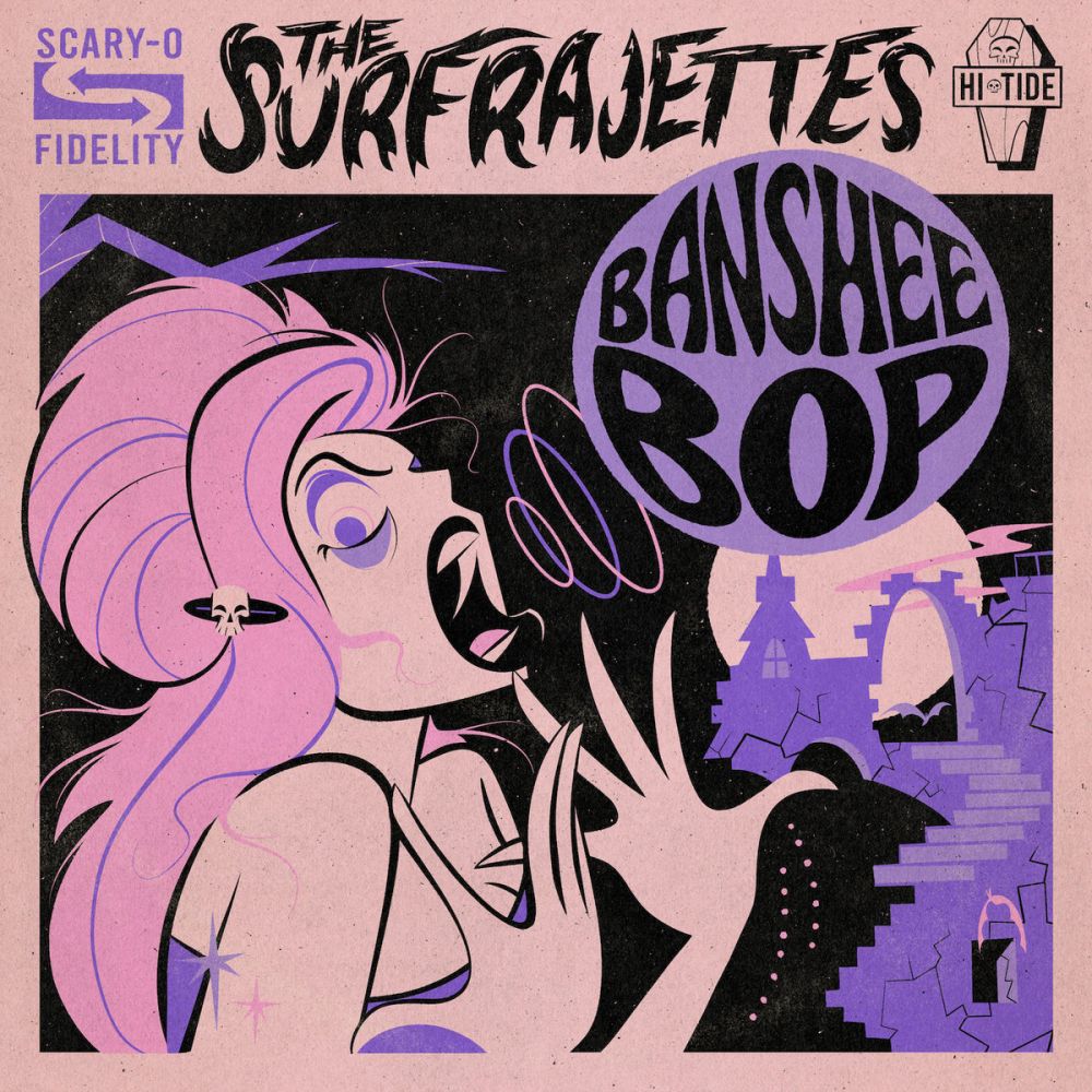
The Surfrajettes - Banshee Bop By Bad Love Design
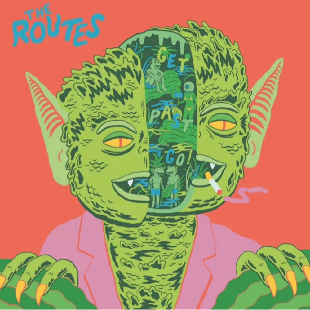
The Routes - Get Past Go by Joseph Harmon
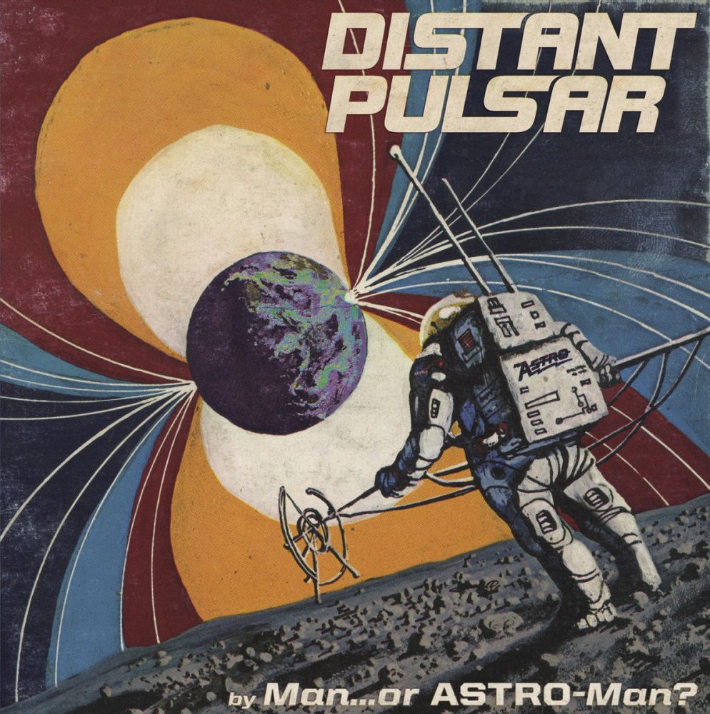
Man... or Astro-Man? - Distant Pulsar by Henry Owings (I think?)
AND THE GREMMY GOES TO
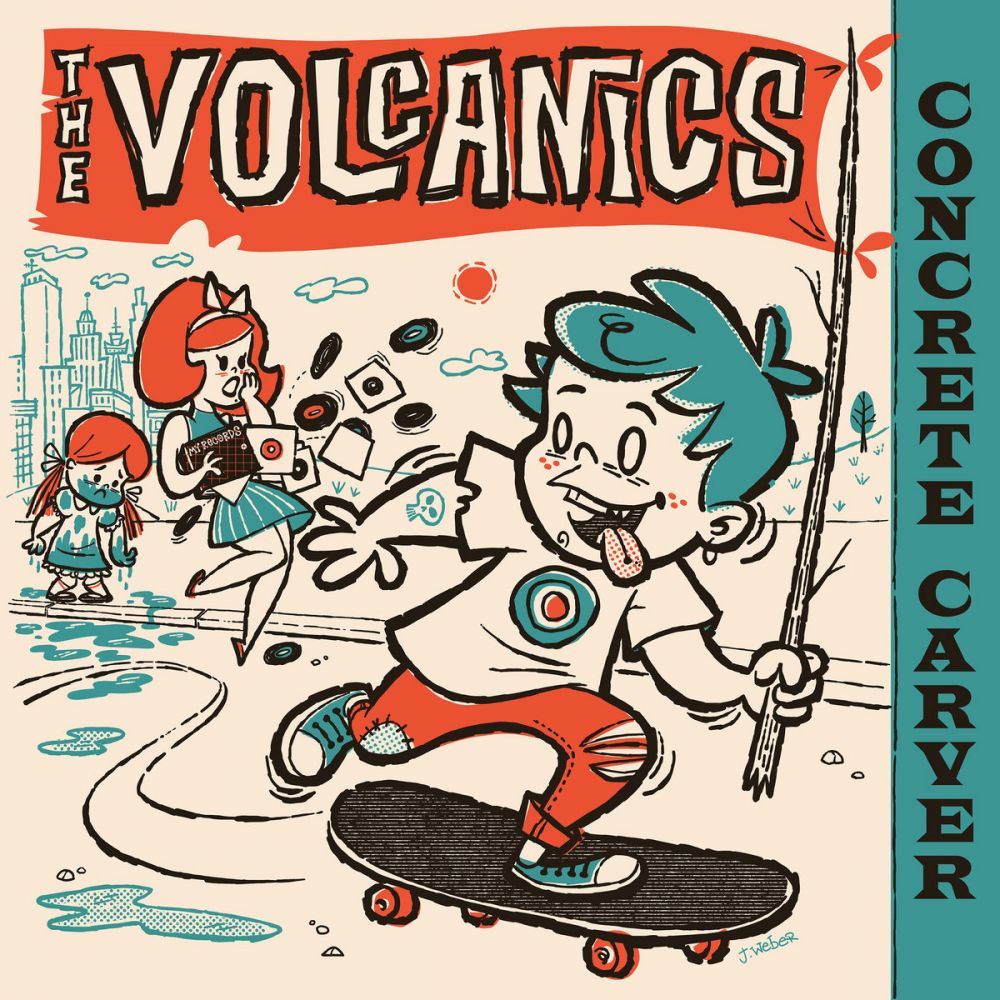
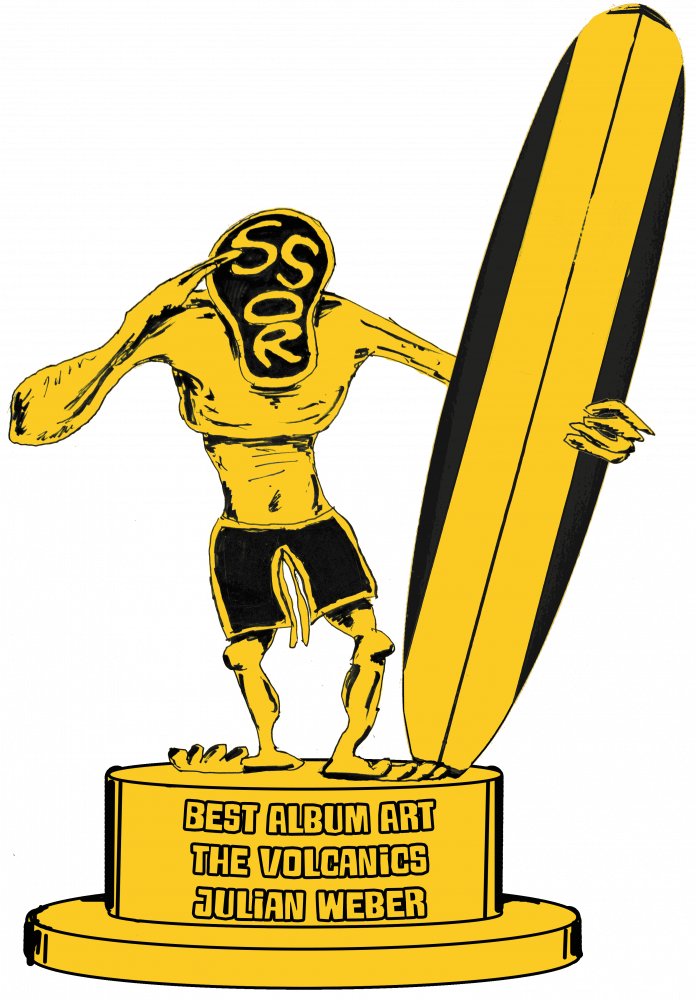
The Volcanics - Concrete Carver by Julian Weber
This list may have a lot of cartoony, limited-palette stuff on it, but what's not to like? The rudeness depicted by the character is emphasized by lots of sloppy-on-purpose detail like like sketchy outlines and coloring that jumps out of bounds. It feels especially appropriate for the music. It still evokes the mid-century nostalgic warm-fuzzies that have been a part of the sweater-clad group's aesthetic since inception, but the bad-boy edge highlights the snarlier edge that came out on this record.
I should note that Julian is hardly a nobody for surfgraphics -- this year alone he also did work for Frankie & the Poolboys, Krontjong Devils and Magnatech, and at least as many last year. So it's cool to hand this .png file to somebody that's done so much great work for this genre. Cherish it as if it were an NFT or whatever.